
Summer Course 2013: Day 8 Make Your Own Website
HTML5 Tag list
Sublime Text 2 directory/file creation
Install AdvancedNewFile.
See details Sublime>Preferences>Browse Packages>AdvancedNewFile>Readme.md drop to sublime to read
cmd+option(alt)+nThen type directory/filename.
ctl+opt+enterThis will display a space at the bottom to enter your abbreviation and real code in the main panel.
Sublime Text 2 Emmet abbriviation list
Emmet CSS Snippets for Sublime Text 2
Solution Assignment from Day 7
Solution for More Pracitce in Day 7
CSS Frameworks
Download from 960 Grid system. Copy reset.css, 96012col.css, text.css
.wrap>header>h1{My Wesite}+nav>ul>li*3>a[href=#]

<!-- after header -->
.main>.primary>p{My content goes here.}^aside

<!-- Within aside -->
ul>li*6>a[href=#]{Item}96012col.css
.container_12 {
  margin-left: auto;
  margin-right: auto;
  width: 960px;
}
Add .container_12 to .wrap. You can add multiple class but not to id.
<div class="wrap container_12">Overwrite 960grid in css/style.css
.container_12{
    background: red;
}
Add .grid4 to header>h1 and .grid8 to header>nav. All have to add up to 12 in 96012col.css. Also notice that all .grid is floated. So it will collapse.
Edit style.css
nav li{display: inline;}Add .grid8 to .primary and .grid4 to aside. And add bg to see clearly.
aside{background: green;}
.primary{background: #e3e3e3;}
header{
    background: yellow;
}
Check it in your browser. aside class="grid_4" should be on the right. But it is not. Because it is not clearing.
To solve it, you can add clear=both to .primary but it is partially fix the problem. It does not show yellow bg color. Add overflow:hidden; to header{} or add grid960's class="clearfix" to header.
/*css*/
header{
    background: yellow;
    overflow:hidden;
}
Or HTML
<header class="clearfix">960 will add clearfix to after that class.
/* http://www.yuiblog.com/blog/2010/09/27/clearfix-reloaded-overflowhidden-demystified */
.clearfix:before,
.clearfix:after,
.container_12:before,
.container_12:after {
  content: '.';
  display: block;
  overflow: hidden;
  visibility: hidden;
  font-size: 0;
  line-height: 0;
  width: 0;
  height: 0;
}
More CSS
.main{margin: 30px 0;}But again you need to add .clearfix to .main since all the divs under .main are floated.
<div class="main clearfix">
...
In order to align top menu and right column menu, change h1 class to grid8 and nav to grid4.
<h1 class="grid_8">My Wesite</h1>
<nav class="grid_4">
Add a color to nav.
/*css*/
nav{
    background: orange;
}
Lines are aligned but not list items due to margin-left.
nav li{display: inline; margin-left:0; margin-right:30px;}Adding contents
We add four columns. Remove
<p>My content goes here.</p>And type (section.grid_2>p>lorem20)*4.
<div class="main clearfix">
<div class="primary grid_8">
    (section.grid_2>p>lorem20)*4
    <p>My content goes here.</p>
</div>
This will produce the followings.
<section class="grid_2">
    <p>Lorem ipsum dolor sit amet, consectetur adipisicing elit. Accusantium repellendus quas dolor quo pariatur explicabo obcaecati fugit voluptatem rem vel.</p>
</section>
<section class="grid_2">
    <p>Ea veritatis mollitia dolorum explicabo atque in hic doloribus ipsa fuga asperiores. Architecto deleniti nihil dignissimos sed ducimus dolores error.</p>
</section>
<section class="grid_2">
    <p>Quibusdam nisi saepe vitae illum laboriosam et eaque adipisci nesciunt iure voluptates reiciendis veritatis dolores nemo facilis ullam dolorem voluptas?</p>
</section>
<section class="grid_2">
    <p>Sapiente placeat quibusdam cumque enim autem magni rerum culpa earum voluptate quo. Sint voluptatibus reiciendis deserunt illum architecto nemo accusamus.</p>
</section>
Check it on your browser. It creates only three columns because of margin-left on the first column and margin-right on the last column. Take it out on your web deveoper tools(element style).
Grid960 provides alpha and omega class for this situation.
.alpha {
  margin-left: 0;
}

.omega {
  margin-right: 0;
}
Add alpha to the first column and omega to the last column.
<!-- first column -->
<section class="grid_2 alpha">
    ...
<!-- last column -->
<section class="grid_2 omega">
    ...
Copy all the sections and paste them. Since all are foated to left, it align nicely.
Now let's add headings. Select p-tag
<p>and hit ctl+cmd+g to select all of p-tag. then add h4 above p-tag.
//h4 tab
<h4>My heading</h4>
Box model
Adding padding will break the code.
Total width, Total height = width + margin + padding + border
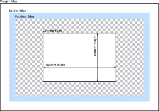
IE vs FF,Chrome
Solution 1: Adding div under each section.
<section class="grid_2 alpha">
    <div>
        <p>Lorem ipsum dolor sit ame rem vel.</p>
    </div>
</section>
<section class="grid_2 alpha">
    <div>
        <p>Lorem ipsum dolor sit ame rem vel.</p>
    </div>
</section>
<section class="grid_2 alpha">
    <div>
        <p>Lorem ipsum dolor sit ame rem vel.</p>
    </div>
</section>
<section class="grid_2 omega">
    <div>
        <p>Lorem ipsum dolor sit ame rem vel.</p>
    </div>
</section>
And add padding to section div.
section div{
    padding: 15px;
}
Solution 2: Using a new technology box-sizing for adding paddings inside width.
section {
    box-sizing: border-box;
    padding:15px;
}
Other CSS Frameworks
20 Exceptional CSS Boilerplates and Frameworks
How to Slice a PSD
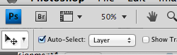
Open Photoshop and tick Auto-Select: Layer. When you click an image, it will select a layer in LAYERS panel. alt+cmd and click the image in the LAYERS panel. (cmd+d to deselect) Copy(cmd+c) it and paste it in a new file. After pasting untick the background. File > Save as Web and Devices and use JPEG for photos and PNG-24 for transparent images.
Ruler in Photoshop
Eyedropper > Ruler.
Asignment 4 PSD to HTML/CSS
Download Simple Website Template PSD
Extra practice
PSD2HTML